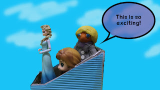
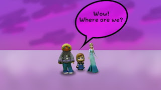
It's the beginning of December and the film is on track to composition. During a discussion session with the lecturer, several style frames of the expected video have been made.
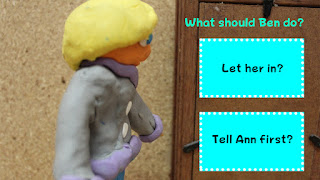 |
| Scene 1 - Choice |
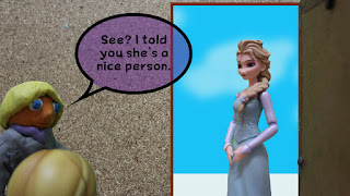 |
| Scene 1 Choice B |
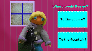 |
| Scene 2 - Choice |
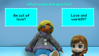 |
| Scene 3 - Choice |
 |
| Scene 3 |
 |
| Scene 4 |
The discussion session highlights the typeface and composition of user interface elements. Several suggestions are made by the lecturers:
- Consider the target audience when choosing the typeface. As this is for college students, a flat, simple and minimalist typeface should be used.
- The choice buttons can be resized to smaller sizes.
- Add some white space (empty space) for breathing room.
- For scene 3 (choice), the question can be placed on top of Ann's head while the choice buttons may be placed above Ben's head, considering the choice buttons can be resized to be smaller.
- Choice button arrangement can be consistent.
- Add thematic frames to the buttons. Consider using complimentary (contrasting) colors or neutral (light grey) for the buttons.
Steps to be taken when editing:
- Add frames to the buttons.
- Change typeface to a simpler, flat typeface
- Rearrange the button composition to accommodate breathing space.


No comments:
Post a Comment