Wednesday, 19 December 2018

Green screen backdrops

Backdrops are almost done for the project!

Outside the siblings' house.

The Snow Queen's throne room.

Inside the mirror.

The frozen lake.

The fountain.

The square.

The village in winter.

The village in summer.


Tuesday, 18 December 2018

Delayed release and trailer reveal!

Due to conflicting schedules that includes rushed paperwork deadlines, production of The Snow Queen Goes Interactive is slowing down. Currently, the short is in its post-production stages, with all the stop-motion sequences rendered and ready for editing. The short is expected to be released on YouTube at end 2018, but will be pushed to a new date: by February 2019.

At the same time, a series of functionality tests were conducted. And the project is also given a new task: to make an introductory video for the project to show its functionality and introduce the project altogether.
Wednesday, 5 December 2018

Major updates!

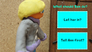
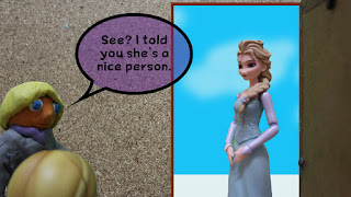
It's the beginning of December and the film is on track to composition. During a discussion session with the lecturer, several style frames of the expected video have been made.

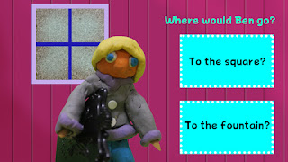
Scene 1 - Choice

Scene 1 Choice B

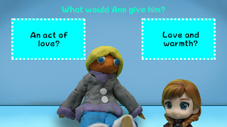
Scene 2 - Choice

Scene 3 - Choice

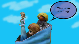
Scene 3

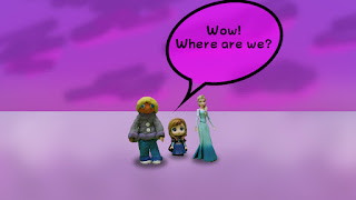
Scene 4


The discussion session highlights the typeface and composition of user interface elements. Several suggestions are made by the lecturers:

  • Consider the target audience when choosing the typeface. As this is for college students, a flat, simple and minimalist typeface should be used.
  • The choice buttons can be resized to smaller sizes.
  • Add some white space (empty space) for breathing room.
  • For scene 3 (choice), the question can be placed on top of Ann's head while the choice buttons may be placed above Ben's head, considering the choice buttons can be resized to be smaller.
  • Choice button arrangement can be consistent.
  • Add thematic frames to the buttons. Consider using complimentary (contrasting) colors or neutral (light grey) for the buttons.
Steps to be taken when editing:
  • Add frames to the buttons.
  • Change typeface to a simpler, flat typeface
  • Rearrange the button composition to accommodate breathing space.